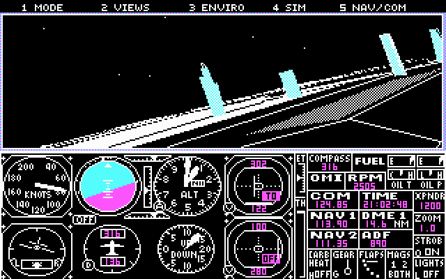
Chicago Meigs, in DOS op een PC: een wireframe toren met allemaal X-en erop en dan een verticale lijn bovenaan. Pt pt pt pt pt ptptptptptptptpt en glorieuze CGA-graphics in cyaan, magenta, wit en zwart.
En dan een paar jaar later een quantum leap op Atari ST.
En dan nog wat jaar later, dat Microsoft stopte met Flight Simulator.
Tot nu, tien jaar later. Ze zijn terug. En hoboy, hoé zijn ze terug:
Breaking Bad was een fantastisch goede serie. Ademloos van begin tot einde gekeken.
En een uitstekend einde, ook.
Niet alles werd 100% afgesloten, in de laatste afleveringen van Breaking Bad. El Camino, de Breaking Bad film die vroeger deze week uitkwam op Netflix, vertelt het einde van Jesse Pinkman.
Zoveel respect voor de filmmakers: ze gaan er gewoon van uit dat we vorige week de finale van Breaking Bad gezien hebben, dat we nog precies weten wie wat wanneer en waar deed, en slagen er gewoon in om een prachtige kleine film te maken rond Jesse die probeert te vluchten.
Ik weet niet goed of het aanvoelt als een film of als een lange aflevering. De twee, denk ik. Nu, de afleveringen van de serie waren hoedanook serieus filmisch, dus ja. Er was materiaal voor een korte film, en de tijd wordt opgevuld met een aantal flashbacks, die het personage invullen.
En miljaar wat een acteerprestatie van Aaron Paul.
En wat een goed einde, ook. Een epiloog, niet meer dan dat. Geen uitmelking, geen vuurwerk. Een einde.
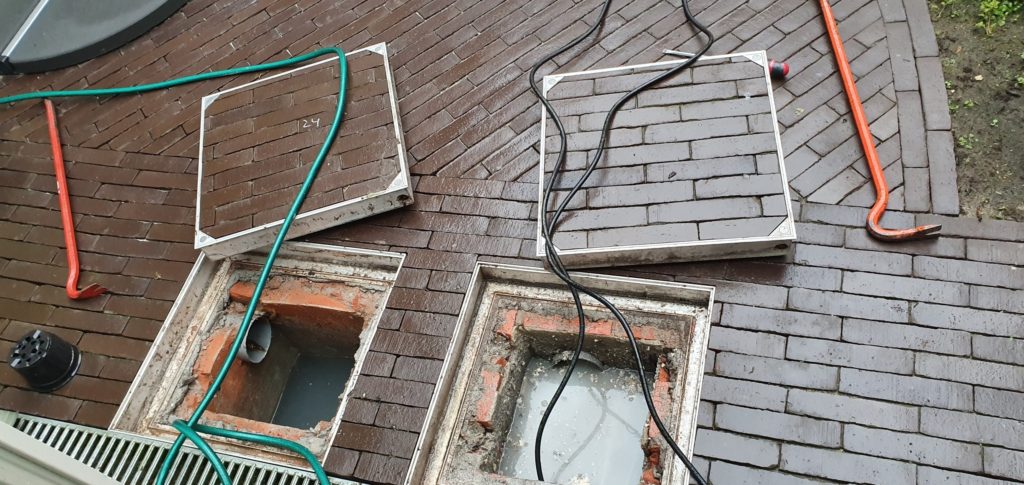
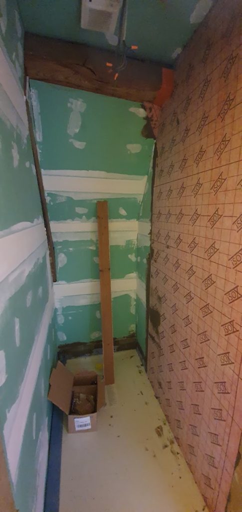
De mensen van de loodgieterij zijn twee dingen komen doen: (1) de leidingen ontstoppen en (2) de douche beginnen maken op het tweede verdiep.
De waterleiding beneden geraakt om de zoveel tijd verstopt. We dachten dat het er mee te maken had dat de bocht tussen de keukenwasbak en de hoofdafvoer te scherp was, en daarom is dan ook een paar jaar geleden de vloer van de keuken opengesmeten om dat stuk leiding te herleggen — maar neen. ’t Ligt waarschijnlijk gewoon aan de helling die te flauw is. Waardoor er om de zoveel tijd ophopingen komen die dan onvermijdelijk dichtslibben en hopla prijs.
Deze keer was het serieus prijs: niet alleen verstopte leiding waardoor het water te traag wegstroomde; het water bleef gewoon staan. Gevolg: stinkende boel en vuiligheid, en we hebben zelfs een overstroming gehad in de keuken.
Maar goed, ’t is dus opgelost. Instructies om het te vermijden: om de zes maand eens een agressief ontstoppingsmiddel door de leidingen jagen. Niet van het gezondste, maar bon, met wat geluk blijft het daarmee min of meer in orde.
En als ze hier toch waren, zijn ze begonnen aan de verbouwingen. Op het tweede verdiep wordt een douche geïnstalleerd, en eens die douche er is, kan er aan de ruwbouw voor de bad- en slaapkamer begonnen worden: vloeren weg, muren weg, leidingen controleren en eventueel vernieuwen of leidingen verleggen waar nodig, nieuwe vloeren, nieuwe muren, nieuw bad, nieuwe wc, nieuwe wasbak, nieuwe douche in de badkamer, nieuwe kast in de gang en in de slaapkamer.
Veel werk dus.
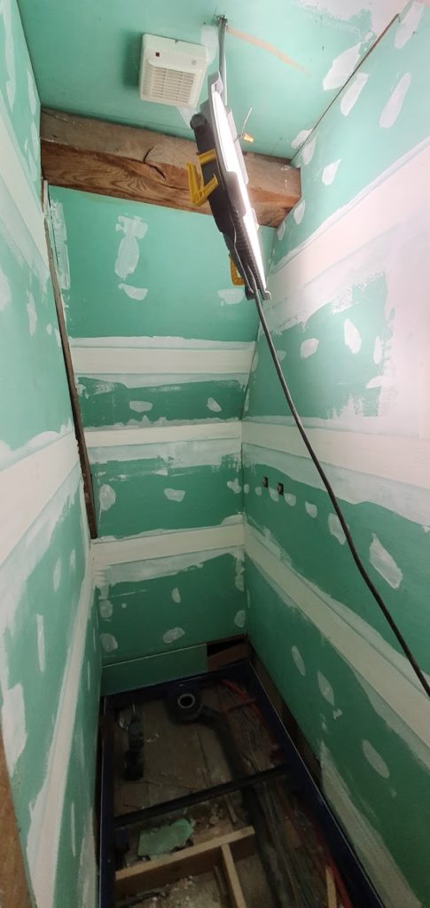
Maar eerst die douche. In een aantal stappen, zo blijkt. Eerst een hyperdeluxe douchebak in gezet, en dan moeten de muren waterdicht gemaakt worden. Maar er zit een balk in één muur van de ruimte, en die moet ook nog behandeld worden. Dat zal voor een volgende keer zijn.
Het langetermijnplan is nog altijd dat ik alle Star Treks nog eens herbekijk. De oorspronkelijke drie seizoenen zitter er op, ’t is de beurt aan The Next Generation.
Raar te denken dat er tussen het eerste (echt wel slechte) seizoen van The Next Generation en de laatste aflevering van de originele serie maar zeventien jaar zitten, terwijl er tussen dat eerste seizoen en nu meer dan 30jaar zitten. Oud worden, ’t is wat.
Ik herinner het mij als de dag van gisteren, dat we ontdekten dat er een nieuwe Star Trek-reeks was. Het internet bestond nog niet, natuurlijk. Ik dénk dat ik er vaag over gehoord had omdat het in een computertijdschrift stond of zo, maar de eerste keer dat we het echt wisten, was toen er in de videotheek cassettes verschenen met telkens twee afleveringen erop.
En dat ik het ook niet echt goed vond, dat weet ik ook nog. ’t Is inderdaad twijfelachtig van kwaliteit, dat eerste seizoen. Een zure appel waar een mens moet door bijten, en alles.
Het was van workshop vandaag. Een man of 25 uit allemaal landen van over heel Europa, interessant project, interessante mensen, en denk ik wel het grootste gemiddelde aantal jaren serieuze ervaring in een complexe materie die ik samen in een kamer gezien heb.
Ik ben blij met de dag: onze ideeën werden niet afgeschoten, helemaal integendeel zelfs. We zijn er blijkbaar met onze relatief weinig ervaring in hun vakgebied (meer wel serieus wat ervaring in ons vakgebied, ha!) in geslaagd om oplossingen te vinden waar een redelijke consensus van grote tevredenheid over was.
En zo zit de week er bijna op. Ziet ge wel dat het rap voorbij zou vliegen.
Het wordt één van die weken, volgende week. Maandag vergaderingen en ’s avonds quiz, dinsdag heel de dag workshop, woensdag verslag en laat ’s avonds avondvergadering op het werk, donderdag online vergadering, en vrijdag ofwel verslag en design ofwel een dag recup.
De meneer zei dat ik kwaad zou zijn om mijn moderne toastmachine, en hij heeft gelijk gekregen:
Een toaster uit 1948, die niet alleen het brood automatisch zachtjes naar beneden en naar boven doet komen, maar die u ook nog eens de mogelijkheid geeft om de kleur van uw toast te kiezen.
Jawel: niet de tijd dat een toast in de toaster zit, en dat het dan bij gewoon brood nauwelijks verkleurd is maar bij melkbrood donkerbruin, maar de kleur van de toast.
En dat allemaal met niets van electronica. Het werkt enkel en alleen op de eigenschappen van metaal, dat uitzet als het warmer wordt en krimpt als het kouder wordt. Zowel voor het op- en neer-mechanisme als voor de kleur van de toast.
Zot.
En ik ben kwaad op mijn toaster en ik wil er zo een hebben, nu.
Ik was met een toegegeven half oog aan het kijken naar The Politician, en toen deed iemand een zang op een begrafenis en plots deed mijn hele hoofd van EVAN. HANSEN.
Volgende week is er een belangrijke workshop en ook een belangrijke vergadering. Maar ik ben ziek en ik kan mij moeilijk concentreren. Ondertussen al anderhalve dag in het water op een druk moment, bah.
Het is wachten tot de wolken wat optrekken in de namiddag en avond, en dan laat doorwerken. En aangezien er ongetwijfeld weekendwerk aan te pas komt, kom ik ongetwijfeld aan mijn normale aantal gewerkte werkweek-uren, of misschien zelfs wat meer.
Mijn rug heeft een ingebouwd mes gekregen. Mijn spieren doen allemaal individueel pijn. Zo ver, zo normaal. Grieperig.
Maar ook: mijn neus is verstopt en dan niet meer. Ik kan niet meer spreken van de keelpijn en dan weer wel. Ik heb gedurende stukken van een half uur drie kwartier gelijk een oorontsteking, en dan weer niet.
Ge ziet, dat komt ervan, met vreemde mensen omgaan. Ge doet allemaal vreemde ziektes op.
Ik dacht: het wordt geen goeie dag vandaag. Opgestaan met pijn in mijn rug en hoofdpijn.
Naar het werk geraakt — de trein van 6u30 gehaald in plaats van die van 6u38, dus een beetje vroeger dan anders — maar ’t was dus niet in orde. Het ging nog ’s ochtends, maar tegen helf-voormiddag werd het lastig. En in de namiddag was het nog wat minder.
Overal spierpijn (naast mijn rugpijn, die denk ik gewoon rugpijn zonder verwantschap met iets anders was), koppijn, misselijk. De tweede helft van de namiddag was euh niet aangenaam. De reis naar huis was kak.
Anna heeft al een tijdje min of meer hetzelfde: een virus of zoiets, dat ambetant doet zonder echt door te breken in totale breakdown-ziekte.
Normaal gezien zitten we ergens in het midden: poule twee van de drie, en net niet goed genoeg om die te winnen. We beginnen dan met een goede ronde (of twee), en dan zakt het ergens in en is er één ronde waar het echt slecht is.
Om de zoveel tijd zakken we dan naar poule drie, waar we (als er tenminste geen valse slechte ploegen in poule drie zitten) kans hebben om soms eens te winnen.
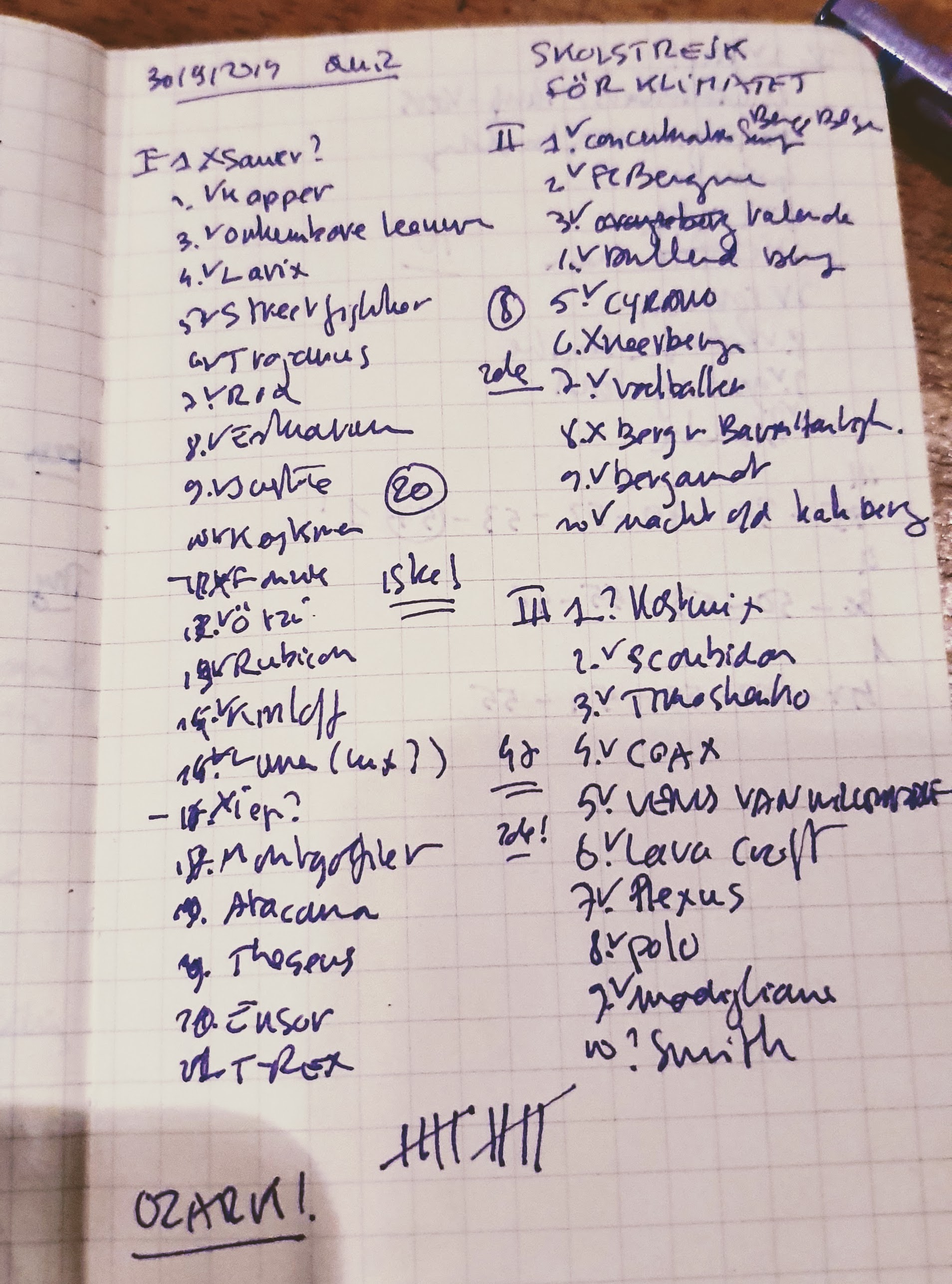
Gisteren ging het onverwacht goed, en hebben we niet alleen poule drie gewonnen maar de hele quiz!
Het begon onverwacht met een meevaller: ronde één was gebouwd rond een akrostichon, de slogan op het bordje van Greta Thunberg. Ik had die ondertussen genoeg gezien om te weten dat het SKOLSTREJK FÖR KLIMATET was, en dan was het eigenlijk alleen maar meer invullen. We hadden één ding niet, een reeks van Annie M.G. Schmidt. Het klonk als Minoes, maar het moest beginnen met een I. Het bleek Ibbeltje te zijn:
Annie Schmidt beschouwde Minoes een tijdlang als een soort vergeten ‘zelfplagiaat’ van haar eerdere serie verhaaltjes Ibbeltje uit de jaren 60, waarin inderdaad een groot aantal overeenkomsten is te vinden met Minoes. Uiteindelijk gaf ze toch toestemming om Ibbeltje opnieuw uit te brengen.
Na de eerste ronde stonden we op een (heel erg) gedeelde tweede plaats.
De fotoronde die we kregen na de eerste ronde vonden we zó gemakkelijk (Ocasio-Cortez en Trevor Noah en Jane Goodall en zo herkennen) dat we ze op denk ik een minuut ingevuld hadden.
De tweede ronde was allemaal antwoorden met “berg” ergens in, en op een gemeente en een Klara-programma na wisten we alles.
In de derde ronde hebben we echt wel geluk gehad: twee antwoorden die eigenlijk feitelijk misschien door een zeer strenge verbeteraar fout hadden kunnen gerekend worden, zijn juist gerekend, en zo hadden we na drie ronden en een fotoronde maar drie antwoorden fout en stonden we op een gedeelde tweede plaats.
We waren helemaal klaar voor de inzinking in de laatste ronde, en de schiftingsvraag hadden we helemaal in de verkeerde richting geantwoord. Maar neen dus: tien op tien in de laatste ronde. En de quiz gewonnen.
Dat wordt volgende week vechten in poule twee dus, maar hey: ze pakken het ons niet meer af!
Kunt ge ziek worden van teveel menselijk contact en van introvertigheid? Drie dagen in Budapest gezeten, verjaardagsfeest vrijdag, trouw zaterdag: zondag was het helemaal op.
Ik heb enorm mijn best gedaan om de laatste zes afleveringen van het laatste seizoen van Jane the Virgin te bekijken (fantastisch!), maar daarna ben ik gecrasht en in bed gekropen tot ’s avonds.
Afsluiting van Dok gemist daarmee, maar ik denk dat het toch niet zou gelukt zijn: te veel mensen bij elkaar. En maandag weer werk.
Ik zou er denk ik redelijk van genieten om gewoon nooit meer buiten mijn eigen huis te moeten komen.